24 interactive website backgrounds for technical B2B sites, live and in code
Generic gradients make every B2B site look the same. These 24 backgrounds react to the cursor, run in plain canvas and each say something about what a technical company does. Move your pointer over any of them.
 Jaro
Jaro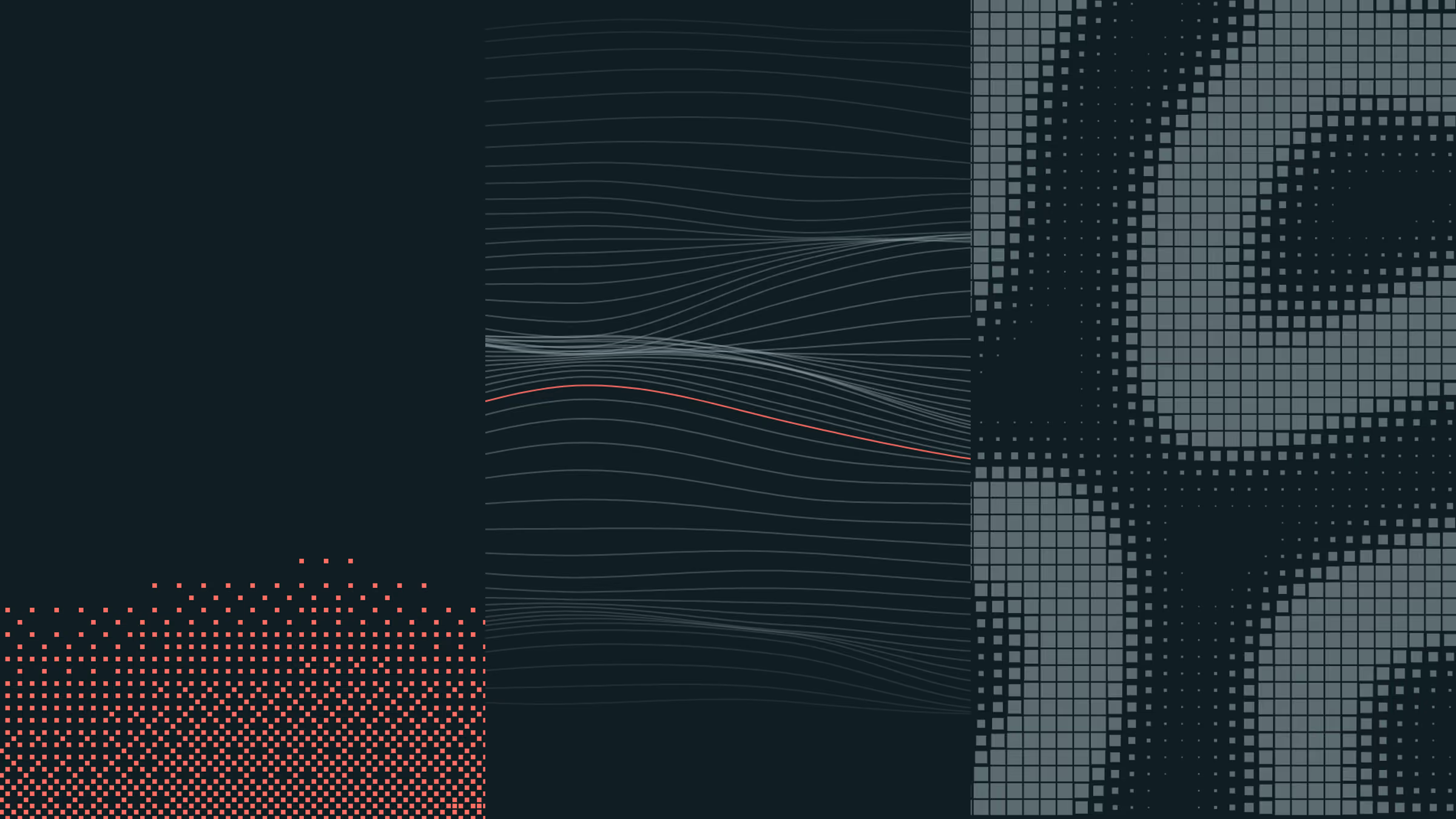
On this page
- 01What is an interactive website background?
- 02Why technical B2B websites should use one
- 03Animated gradient vs interactive background
- 04Gradients, light and texture
- 05Type and characters
- 06Lines and signal
- 07Systems and simulations
- 08How to add an interactive background to your website
- 09Keep it fast: the performance checklist
- 10Keep it on brand
- 11How we built them
Key takeaways
- 01An interactive background should say what your company does, not just look nice.
- 02Technical B2B buyers read craft as competence: a coded hero is proof, not decoration.
- 03Plain 2D canvas covers almost all of it. No library, a few kilobytes, no WebGL.
- 04Pause it off screen, respect reduced motion, keep the text as the largest paint.
- 05One accent colour and hairline greys keep even a physics simulation on brand.
Search for “animated gradient background” and you get the same soft purple blob that sits behind half the SaaS homepages on the internet. It is pretty, and it says nothing. For a technical B2B company that is a missed chance, because the first screen is where a buyer decides whether you are serious. This article collects 24 interactive website backgrounds we built in code, each running live on this page, with the kind of company each one suits and the rules that keep them fast.
What is an interactive website background?
An interactive website background is an animated layer behind your content that is generated in code and responds to the visitor, usually the cursor. A static gradient or a looping video plays the same for everyone. An interactive background reacts: lines part around the pointer, particles scatter, a grid bends toward it.
That reaction is the point. It turns the hero from something people look past into something they touch for a second, and that second is when they notice the craft behind the site.
Why technical B2B websites should use one
Technical buyers judge your product by everything they can see before a demo, and the website is the first thing. A background that is clearly engineered, that responds precisely and runs smoothly, is a small proof that the team behind it cares about detail. A template gradient is proof of the opposite.
Three reasons it works especially well for B2B tech:
- It can explain what you do. A data company can show data flowing. An infrastructure company can show a system under load. A biotech can show growth. The background becomes a metaphor for the product, not decoration.
- It differentiates in a category of lookalikes. Most B2B SaaS heroes use the same layout, the same gradient and the same dashboard screenshot. Motion that is yours is one of the few things a competitor cannot copy from a template.
- It holds attention without asking for it. A subtle, reactive layer keeps people on the first screen a few seconds longer, while the headline does the selling.
And when not to use one: if your audience is on slow devices, if your headline is weak, or if the motion would compete with a product demo above the fold. A background supports a message. It never replaces one.
Animated gradient vs interactive background
An animated gradient moves on its own: CSS keyframes shifting colours, or a looping video. An interactive background is computed every frame and reacts to input. Gradients are cheaper and fine for a calm brand. Interactive backgrounds cost a little more and say a lot more.
Popular styles you will see searched for, and where they sit:
| Style | What it is | Interactive? |
|---|---|---|
| Mesh or grain gradient | Soft colour blobs with film grain | Can be, drawn on canvas |
| Animated gradient (CSS) | Keyframed colours or positions | No |
| ASCII background | Text characters as pixels | Yes |
| Dither effect | 1-bit pixel shading | Yes |
| Particle background | Many small moving points | Yes |
| Generative art | Rules that draw over time | Yes |
Gradients, light and texture
These are the closest to a classic gradient background, with more depth and a response to the cursor. Good when the brand should feel warm and premium rather than technical.
Aura
A soft gradient mesh in brand tones, rendered tiny and scaled up for free blur, with film grain on top.
Dithered horizon
A brand glow rising from the lower right, ordered-dithered to 1-bit squares, the coded look of our film.
Halftone
Print halftone of a slow swell. Dot size carries the tone; the pointer acts as a loupe.
Interference
Two wave sources on a dot grid, their rings adding and cancelling into moiré. Move the pointer to become the second source.
Type and characters
Typography as texture. These work when the brand voice is strong and a little bold, and for companies whose product is code or language.
Terrain of characters
Slow 3D noise read as type density. Grey where it is calm, brand red where it peaks. The pointer lifts the field.
Kinetic type
Rows of words in outline sliding at different speeds, one solid row in brand red. Hover a row and it stops to be read.
Dissolve
The 3DAY wordmark rebuilt from thousands of particles on springs. The pointer scatters them; fast ones run hot in red.
Rule 30
A one-dimensional cellular automaton scrolling up like a data feed, order and chaos from one line of rules. The pointer seeds a cascade below it.
Lines and signal
Hairlines read as precise and technical. These suit companies whose product is data, measurement or connection.
Ridgeline
Stacked signal lines that swell in the middle, each one hiding the next, the way a pulsar's readout looks.
Signal
Thousands of particles following a curl of noise, leaving fading trails. A few run hot in brand red.
Strings
Sixty threads strung across the frame, each bent by its own slow wind. Draw the pointer through them like a comb.
Contour
A survey map of a landscape that keeps moving. Marching squares draw the isolines; one level is marked in red.
Wireframe range
A mountain range in true perspective, flown over slowly. Lines thin out into the distance; the pointer raises a peak.
Gravity well
Our own 12-column grid, bent by a mass that wanders and follows the pointer. The layout system, as physics.
Systems and simulations
The most surprising group: real physics and growth rules running in the background. They suit research-heavy companies, where showing a system behave is the most honest metaphor.
Differential line
One closed hairline that grows by splitting, folding into coral as it runs out of room. The pointer is an obstacle it folds around.
Venation
Veins grow up from the twelve column lines toward scattered food, the way leaves and river deltas form. The dots are food; the pointer drops more, and the veins turn toward it.
Reaction
Gray-Scott reaction-diffusion drawn as a dot-matrix sign: square size follows the chemical. The pointer injects the catalyst.
Cells
A Voronoi tissue of drifting seeds, drawn as membranes. The pointer is a cell too, pushing the others aside.
Murmuration
Six hundred hairline boids flocking by three simple rules, drawn toward the column lines when calm. The pointer is a predator; follow the red one.
Frost
Crystal dendrites creeping in from the edges by diffusion-limited aggregation. The pointer's warmth melts a hole wherever it goes.
Verlet curtain
A hairline mesh hanging from the top edge like fabric, simulated with Verlet physics. Sweep the pointer through it like wind.
Circle packing
Each of the twelve columns fills with tangent circles that grow until they touch. The pointer pops them and the gap refills.
Orbit
A thousand points on a sphere, turning. Depth sets size and tone; a scan line in brand red sweeps the latitudes.
Liquid metal
Real 3D without WebGL: three spheres melted together, sphere-traced at 160 pixels wide and shown as crisp large pixels. One drop follows the pointer, which also moves the light.
How to add an interactive background to your website
Draw it on a single canvas element behind the hero, generated from a small script with no library. Every background on this page is under a few hundred lines of maths, uses the 2D canvas API and reads its colours from the site’s design tokens, so it follows light and dark mode automatically.
The structure that keeps it simple:
- One canvas, positioned behind the content. Absolutely positioned,
pointer-events: none, markedaria-hiddenbecause it is decorative. - One loop, one effect function. Each frame, the effect receives the canvas size, the time, the pointer and the theme colours, and draws.
- Colours from tokens, not hex codes. Read them from CSS custom properties at runtime, and the background matches the brand and both themes without extra work.
- The pointer eases in and out. Track a 0 to 1 value that rises while the cursor is over the section and falls when it leaves, so nothing snaps.
Keep it fast: the performance checklist
An interactive background must never cost you the speed score. These rules kept our pages at 100 for performance on desktop and in the high 90s on mobile, with the background running.
- Start after load. The background begins once the page has finished loading, so it never delays the first paint.
- The headline is the largest paint. Never let the canvas become the Largest Contentful Paint. Text first, motion after.
- Pause off screen. An Intersection Observer stops the loop when the section scrolls away, and the loop also stops in hidden tabs.
- Respect reduced motion. Visitors who turn animation off get one still frame of the same image.
- Simulate small, draw big. Heavy effects run at reduced resolution and scale up: reaction-diffusion at 128 cells wide, the 3D metal at 160 pixels wide.
- Cap the device pixel ratio at 2. Above that, the cost grows and nobody can see the difference.
Keep it on brand
The difference between a background that looks premium and one that looks like a demo is restraint. Ours follow three rules: hairline greys from the text colours, one accent colour used on a single element at a time, and the site’s own grid wherever the effect has structure. Even the flocking birds snap toward the column lines when they are calm.
If a background needs more than one accent colour to look good, it is the wrong background.
How we built them
We built all 24 with Claude Opus 5.5 in Claude Code, working from a brief, our design tokens and a short research pass on the generative algorithms behind the best creative studio work. The same approach made our brand film, which we wrote up in Opus 5.5 for video, motion and sound. You can see all of them full screen on our gradients page.
If you want a hero that says what your company does, built to this standard and still scoring 100, tell us what you are building.
Questions founders ask
01What is an interactive website background?
An interactive website background is an animated layer behind a page's content that responds to the visitor, usually to the cursor, scroll or touch. Unlike a looping video or a static gradient, it is generated in code as you watch, so it can react: lines part around the pointer, particles scatter, a grid bends.
02Do animated backgrounds hurt SEO or Lighthouse scores?
Not if they are built carefully. Start the animation after the page loads, keep the headline as the largest contentful paint, pause the loop when the background is off screen or the tab is hidden, and skip libraries. Our pages with these backgrounds score 100 for performance on desktop and in the high 90s on mobile.
03How do I make an animated gradient background with CSS?
The simplest version is a large linear or radial gradient with an animated background-position, or a few blurred, absolutely positioned blobs moving with keyframes. It is cheap, but it cannot react to the cursor. For an interactive gradient, draw radial gradients onto a small canvas each frame and scale it up, which gives a free blur, as the Aura background in this article does.
04Should I use Three.js or canvas for a website background?
Use 2D canvas unless you need real 3D lighting at full resolution. Canvas needs no library and loads in a few kilobytes. Three.js adds around 150 KB before your scene and is worth it for full 3D scenes and shaders. Every background in this article, including the 3D Liquid metal, runs on plain canvas.
05Are interactive backgrounds accessible?
They can be. Mark the canvas as decorative with aria-hidden, keep text contrast at WCAG AA over the busiest frame, and honour prefers-reduced-motion by showing a single still frame. Never put information in the background that is not also in the text.
06Which interactive background suits a B2B SaaS website?
Pick the one that matches what your product does. Data and streaming companies suit flowing particles or ridgelines, developer tools suit ASCII or cellular automata, AI research suits growth and reaction-diffusion, and hardware suits wireframe terrain or liquid metal. Each background below lists the companies it fits.
Sources

Founder and creative director. Nine years and 60+ websites as a Webflow Premium Partner, including the rebrand and site for MobiWire, a top five ODM globally. Runs several SaaS products of his own, including a top three SEO app for Webflow.